A site structure issue

Collapse
X
 
  • Filter
  • Time
  • Show
Clear All
new posts
  • proactivator
    First Lieutenant

    • Mar 2007
    • 178

    A site structure issue

    Hi,
    My site is http://jamesbartondesign.com and I am wondering if I am going the right way about my basic site structure. The site is image dependant ie. I have pages of thumnail images which, when a thumnail is clicked leads to a new page which shows an image of the product with detail, price and eventaully "add to basket" for purchase via a shopping cart. The thought behind this is to have small pages as far as content is concerned so that load times are short and also minimal number of pages that need scrolling. But eventaully there will be nigh on a hundred pages. How does a site actually load: is each page only called up as it is clicked? Now I am wondering If I should use the gallery feature in bluevoda and have the clicked thumbnail open on the same page. With the gallery feature used, do the full sized images reside in that page? Because if they do it may lead to bloated content which takes too long to load.
    Advice would be much appreciated.
    http://www.jamesbartondesign.com
  • limebrook1
    Brigadier General

    • Jun 2005
    • 1583

    #2
    Re: A site structure issue

    I'm sure you'll get other comments on this, but from my experience the trick is to keep the size of your images as small as possible. Using the gallery for say a dozen images does take time to load. See http://www.limebrook.com/christmas06.html which has over 50 images in three galleries for an example. I don't think this matters on some pages, especially if you warn your visitor they may need to wait, but if your whole site is done this way it could be a problem.

    If you are thinking of a gallery type feature, check out the new Lightbox facility - this really adds professionalism to displaying images.

    I also wanted to comment about your desire not to have a lot of content. Sites are picked up by search engines on their descriptive text and mentions of key words and phrases. If you limit the text you may find your site does not get too high in the search engines.
    Trish
    www.Limebrook.com
    www.MountainWalk.co.uk
    www.MyBeardedDragons.co.uk
    www.TucsonForBeginners.com
    www.Pets4kids.info

    Comment

    • proactivator
      First Lieutenant

      • Mar 2007
      • 178

      #3
      Re: A site structure issue

      Hi Trish,
      Many thanks for your input. Yes I do want to keep my pages small: I'm thinking 300kb tops. The lack of text is a worry because I have picked up that search engines use text , keywords etc. However this contrasts with human nature. I find a site with pages that have reams of dense text in a small typeface and endless paragraphs a total turn off. I think I have to play it canny and have a text blurb (not too much) about each item on it's page.
      Re the lightbox do you know if the full sized images are loaded in the same page?
      http://www.jamesbartondesign.com

      Comment

      • davidundalicia
        General

        • Mar 2006
        • 6294

        #4
        Re: A site structure issue

        The page with your enlarged picture will only load when the thumbnail is clicked, so you dont need to worry too much about loading times.
        Have fun
        Regards..... David

        Step by Step Visual Tutorials for the complete beginner
        Newbies / Beginners Forum
        FREE Membership Login Scripts: - Meta Tags Analyzer
        My Social Networking Site - Free Contact Forms
        Finished your New website!! Now get it noticed Here:

        Comment

        • Collectors-info
          General

          • Feb 2006
          • 8703

          #5
          Re: A site structure issue

          Only as a thought! Might you not be better using Soho or similar as a shopping cart for your store & BV if you prefer this for all other areas of your site?
          If you do use BV on its own, I would swing over to Navals .php method to save time with changing many menus if you envisage a lot of pages.
          But personally, I think with the type of products you are selling, it would be nice to have the facilities of automated stock control & many other automated facilities that a cart has to offer. Think it will be a lot more controllable.
          Regards Chris.

          Collectables, Collecting, collectors-info.com

          www.chrismorris.co.uk

          House build project

          Comment

          • proactivator
            First Lieutenant

            • Mar 2007
            • 178

            #6
            Re: A site structure issue

            Hi Chris,
            I intend to use a cart and have downloade soholaunch but have not tried to get to grips with it yet. Am also trying to use Navaldesign's one page menu but it didn't work first time: ended up with a load of html on my published pages. Am licking my wounds before trying again!
            James.
            http://www.jamesbartondesign.com

            Comment

            • Collectors-info
              General

              • Feb 2006
              • 8703

              #7
              Re: A site structure issue

              Once you get your head around navals .php, it save lots of time.

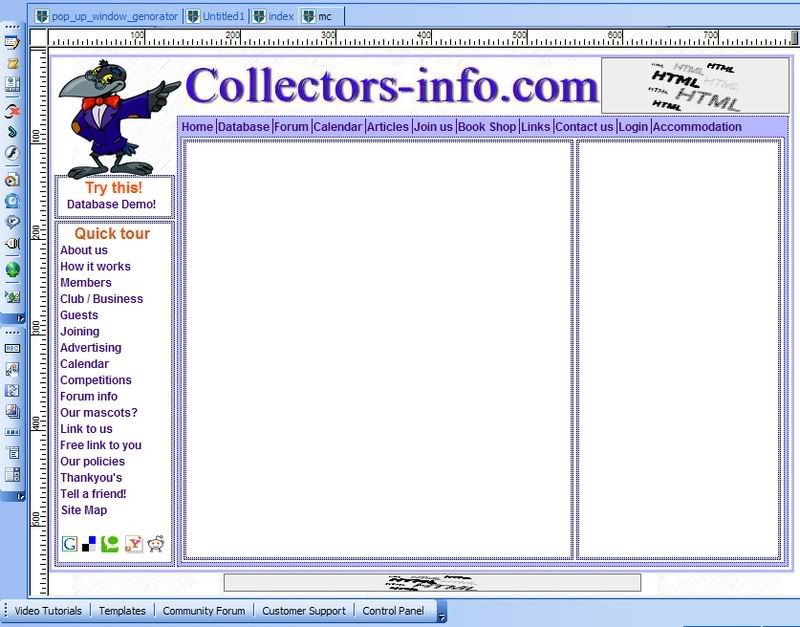
              This is the part that all my menu/header/footer are placed.


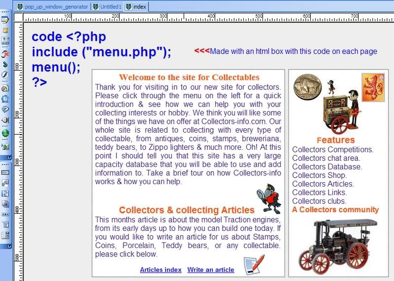
              And this is the area I use for each page.


              If you need any help? Just shout.

              Good luck.
              Regards Chris.

              Collectables, Collecting, collectors-info.com

              www.chrismorris.co.uk

              House build project

              Comment

              Working...
              X