The visitor of a website has complete control and makes all the decisions since he/she is the one who clicks the mouse. Whether the visitor finds the website to be usable is what  determines the success of a given site, not how pretty or visually appealing it is. Imagine choosing a Web Hosting Company based on how pretty the site is. If it does not help you reach your goal then there is absolutely no point. Everything must be user-centric in order to create a profit-oriented website. At the end of the day, what is the point of having a feature if it cannot be used?
Before we begin designing for Effective results, we MUST get to know how our users think!
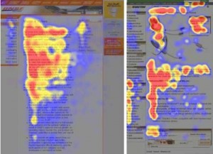
User’s habits when looking at a website are very similar to that of customers in a clothes store. They enter, scan the room for something that catches their eye and go for it. In the same fashion, visitors on your website will look at each page, merely scan the presented text and click on the first link which might probably lead them to what they are looking for.
Users love to ‘click’! They are looking for something which looks interesting, useful and most importantly ‘clickable’. If they are unsatisfied with the new page, they will click on the back button and so the search continues. On VodaHost‘s Web Hosting site for instance you can click on ‘Get Started’ or ‘Check Availability’ or ‘Login’. Those buttons all really stick out.
Important facts to keep in mind:
- The need for control – users do not want new pieces of content popping up while they are browsing a page. They want to rely on the consistent presentation of data. Never open links into new tabs because it is important to the users to be able to click the back button and find themselves in that familiar place they were before in order to continue. Otherwise, they will feel lost.
- There is no linear searching – users typically do not scan a website in a linear fashion, going from beginning to end and through all sections one after the other. They are more likely to scan and click on the first link which might lead them to their goal.
- The insistence on immediate results – web users are not patient. If a given period of time passes and the visitor is unable to find what they are looking for, they will without a doubt leave the site never to look back. If expectations are not met, the designer has failed to create an effective website; customers are lost and with them, their money.

So how do you design your website in a way that makes it as Effective as possible? Here are 10 main principles and approaches you need to follow in order to achieve this goal. By following these principles you will create a more sophisticated, and yet surprisingly simpler web design.
1. Make things obvious
 Steve Krug wrote a book about human-computer interaction. His first law is that you must not make your visitors think. Keep in mind when designing a website that you should be getting rid of any question marks that may arise.
Getting from point A to point B should be self-explanatory so site structure must be intuitive, otherwise users will be lost. What helps visitors reach their aim is a clear, simple structure, recognizable links and subtle visual pathways. If for example you have a couple of sentences promoting your company in an artistic fashion
“Going beyond channels, products and distribution”, you will need to add an explanation. The key to minimizing question marks is to place the explanation on the left hand side and the arbitrary tagline/quotation on the right. As we are used to reading from left to right, you are answering any questions before they are asked.
2. Do not ask for too much
Make sure you do not require too much of your visitors/customers. The less you ask of them, the bigger the chances of users trying your service out. Have you ever been interested in a site but turned away as quickly as possible when you were asked for personal information like your name and contact details? Allow visitors to play with the service you are offering without having to fill in long forms or creating an account immediately.
Users need to have an idea of what they are going to get in return before they commit to a service. You want your users to feel like your service is comforting and unobtrusive. Asking a user to register or subscribe is enough to cut down traffic to your site considerably.
3. Controlling User Attention
Some features stick out more than others. There is no doubt that images catch people’s attention more than text does – similarly bold lettering is more eye-catching than plain text.
As we stated before, human vision is a non-linear mechanism. Motions, patterns and edges are easily recognizable. Have you ever felt immense frustration towards a video ad? It is so irritating because it is THAT eye catching that it cannot be ignored. Naturally the advertiser’s favorite.
Play with the size, font and boldness of text to make sure the important parts stand out. Make sure the users know without even thinking about it how to get from point A to point B. Remember to place important information on the left center of the page. Trust is a very important element and when the visitors feel familiarity because of a great sense of orientation, you are on the right track.
4. Step by Step
Often times, web designers are criticized for using baby steps on their websites. Using 1-2-3-done-steps however is extremely effective. By using this approach of guiding the users, you are taking them through the progress of their work and ultimately not allowing them to get frustrated or bored of the procedure.
Most importantly this simple and direct design allows for clarity within the website and the users are able to identify the functions available. The content is understood easily and a feeling of comfort is provoked when the users interact with the system.
5. Use effective writing
Ask yourself whether you would read a page on the web which looked like a page from a novel you read a few years back. The answer is no. The internet is a completely separate medium to print. Text which is too long, descriptive or exaggerated will be skipped all together.
Get to the point. Get rid of clever names or technically specific language. Your language  must be straight forward and direct. For example if you are introducing a service to customers and you want them to create an account ‘sign up’ is more effective and straight forward than even ‘start now’ or ‘explore our services’.
VodaHost for example gives you the purpose of the website right in front of you as when you open the page – “VodaHost has everything you need to create and publish a fantastic website.” Exactly underneath that it gives you the features included in a monthly price. What else would customers want to know? What they can get, how much they can get it for.
6. Simplicity is Key
Instead of complicating your site by putting cool, futuristic elements into your design, try focusing on keeping it simple. What users are truly looking for is the information they need regardless of the design.
 Your site needs to be so clear to the user that it almost should not matter if they know the language. They should be able to immediately identify the navigation, header, content area and the footer.
For users of your site, the best possible version is a text only site, free of ads and other blocks of content which may just push them in the wrong direction. One path is enough thank you very much!
7. Do not fear empty space
Empty space (text and image) is actually underestimated. Using empty space can considerably reduce the cognitive load for your viewers. When looking at a page which is jam packed with information, it becomes hard to take it all in and disrupts concentration. It is in our human nature to immediately try and categorize and divide content in order to make it more digestible.
Try using empty space to separate two segments of a website instead of a visible line. It is a well known fact that Hierarchical Structures aid in reducing complexity and therefore your content will be perceived more easily.
So, use white space in your website layout for a more scannable, functional design.
8. Use Visual Language
Aaron Marcus is a well known information-visualization designer. It is his accepted belief that there are three fundamental principles to ‘visible-language’ – Organize, Economize and Communicate.
- Organize: Structure is of paramount importance when designing visual
 communication. The structure itself must be clear and consistent all the way through; the pattern followed on each and every page. Navigation, orientation, consistency, and the relationships of all these elements must be thought out before being applied.
- Economize: Namely, keep it simple. You do not need many cues and visual elements to produce an effective website design. Emphasize your important points, keep your pages distinctive (the main, most important properties need to be distinguishable), clear and simple. Less is always more.
- Communicate: Make sure that your message can be easily understood and is at the lever of your target market. Within this section you must consider typography, symbolism, readability, reader views and even color and texture. Your website must suit your target market on all of these levels.
- 9. Keep to Conventional Designs
Using a design which is common does not necessarily mean that your site will be boring. It is actually an advantage if you do so. Users will not have to get used to or go through a learning curve to be able to navigate your site. Imagine going to your local big supermarket and as you walk in, you realize that all the products are jumbled and in different corridors to what they were before. You are going to get seriously frustrated and you will take double the time to reach your goal. The same exact thing happens with the visitors to your website.
There is no use confusing your customers. Keep to a conventional web design. By doing this you will also gain your customer’s trust, you will appear reliable, and you will prove your credibility.
10. Test, Test, Test
This last point cannot be stressed enough. The worst thing as stated in previous articles is that a function or link on your website does not work properly.
Make sure you test the usability of your website because this can provide important  insights into problems or issues that may have to do with your layout. Plus, the site must give users the capabilities they expect to find on your type of website.
It is an ongoing progress, you design something, test it, tweak and fix it and then you need to test it again. You will end up doing this several times and then must go back and do it again after a certain time. All results from usability tests are useful and only serve to improve your website. A great tip is to ask someone else to test your site and give you their honest and experienced opinion. VodaHost Web Hosting for example, has a forum where you can ask that a professional have a look at the design of your website and advise you accordingly.
Suggested reading: “The Secrets to Promoting Your Website Online” by VodaHost web hosting


